MAX Best Of
The 5 Best Primary Brights Maximalist Rooms
When red, blue, and yellow walk into a room, nobody asks them to tone it down.
Primary colors get a bad rap as kindergarten territory, but these five maximalist spaces prove that red, blue, and yellow are the holy trinity of fearless design. Whether they're dancing across Memphis squiggles, saturating Mexican courtyard walls, or splashing across a kid's room that adults secretly envy, primary brights bring an unapologetic joy that pastels could never.
The secret to pulling off primary brights in a maximalist space? Commitment. Half-hearted primaries look like a preschool accident, but when you lean all the way in with pattern, texture, and unapologetic color layering, you create spaces that feel both nostalgic and utterly now. These rooms don't whisper—they shout in three-part harmony, and we're here for every decibel.
 1Save
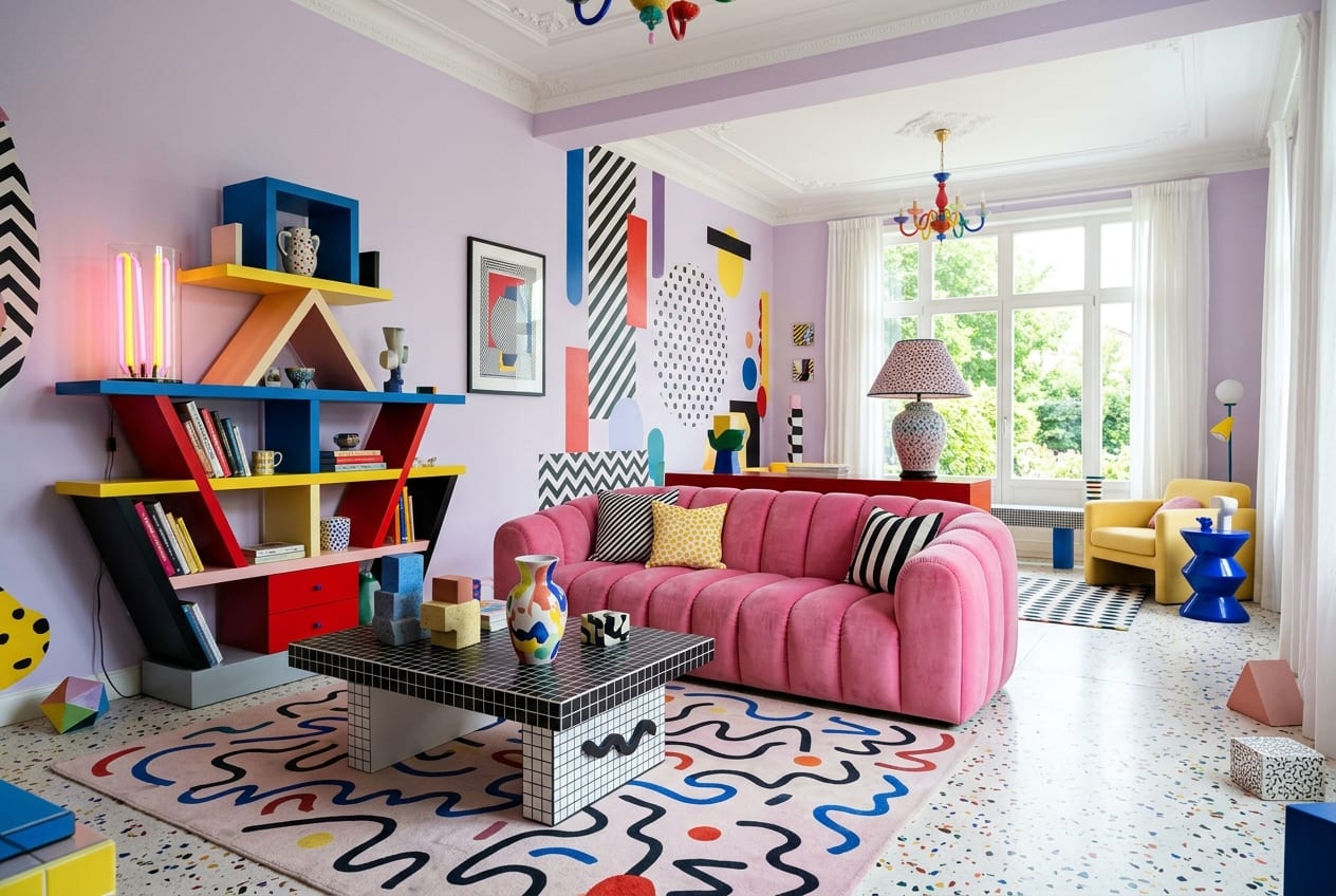
Ziggy · Memphis Revival
Postmodern Squiggles Gone Wild
Ziggy throws straight lines out the window and replaces them with Memphis squiggles and confetti terrazzo against a lilac backdrop that makes primary brights pop like fireworks. This is postmodern maximalism at its most playful, where every surface gets the squiggle treatment and geometry becomes a choose-your-own-adventure. The primary color palette feels both retro-eighties and utterly contemporary, proving that some design movements deserve infinite encores.
Steal this: Layer primary-colored squiggle motifs over a soft lilac base to make brights feel sophisticated.
 2Save
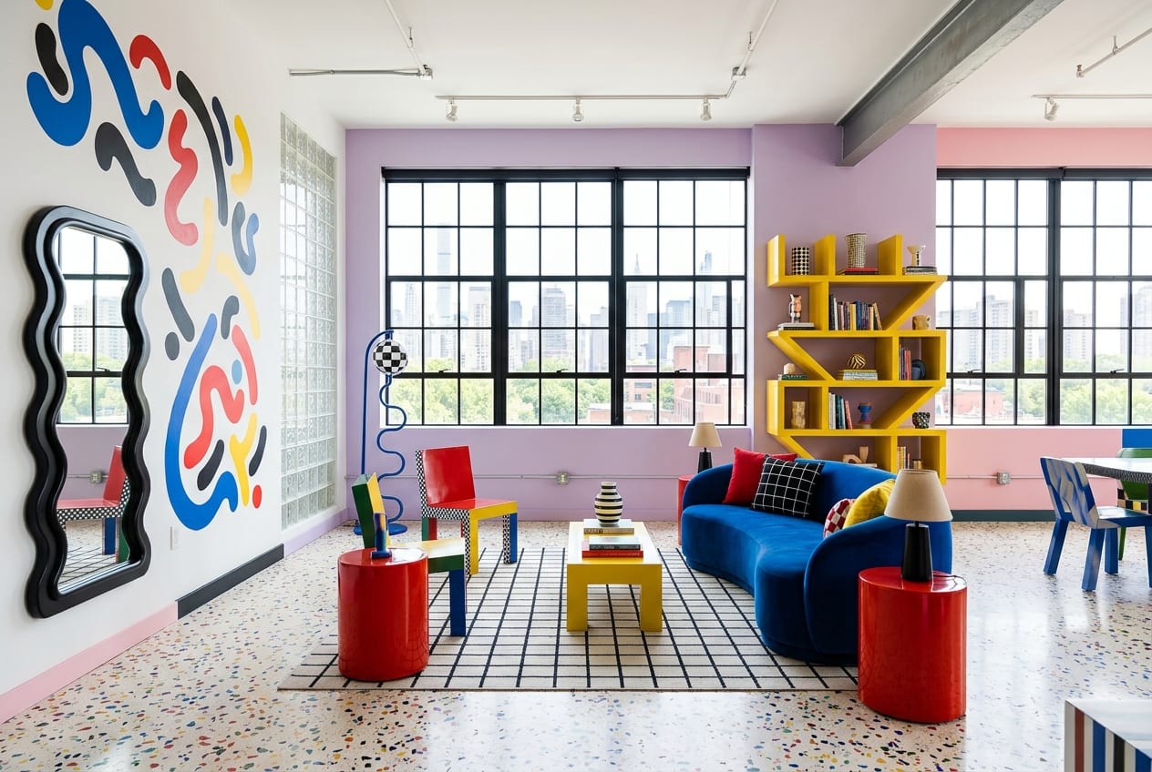
Dot · The Memphis Loft
Draw Outside Every Single Line
Dot takes the Memphis revival loft concept and cranks it to eleven with lilac walls, cobalt curves, and primary squiggles that refuse to stay inside any boundaries. The confetti terrazzo flooring anchors the chaos with tiny bursts of every primary shade, while the cobalt curves carve out architectural moments that feel both structural and purely decorative. This is what happens when you furnish the doodles instead of erasing them.
Steal this: Use cobalt blue as a structural element through curves and arches to ground playful primary accents.
 3Save
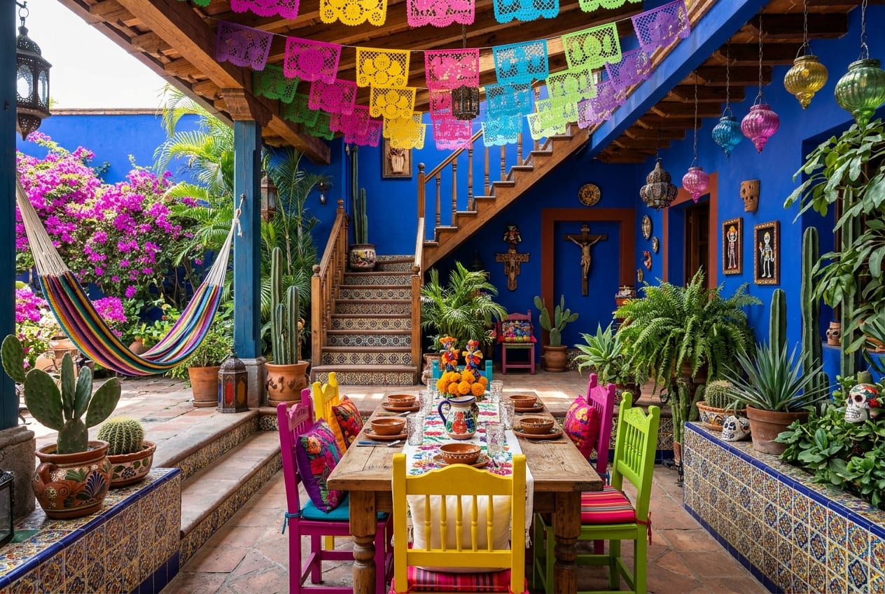
Paloma · The Casa Azul Patio
Cobalt Walls Welcome Everyone
Paloma wraps an outdoor patio in saturated cobalt blue that makes the magenta bougainvillea practically levitate with color contrast. Talavera tiles bring in traditional pattern while papel picado flutters overhead, creating dappled primary-bright shadows that dance across the space. This is Mexican maximalism that understands color as hospitality—the cobalt walls don't just frame the party, they throw it, and every guest leaves plotting their own blue room.
Steal this: Paint exterior walls in saturated cobalt to make flowering plants and tile patterns explode with intensity.
 4Save
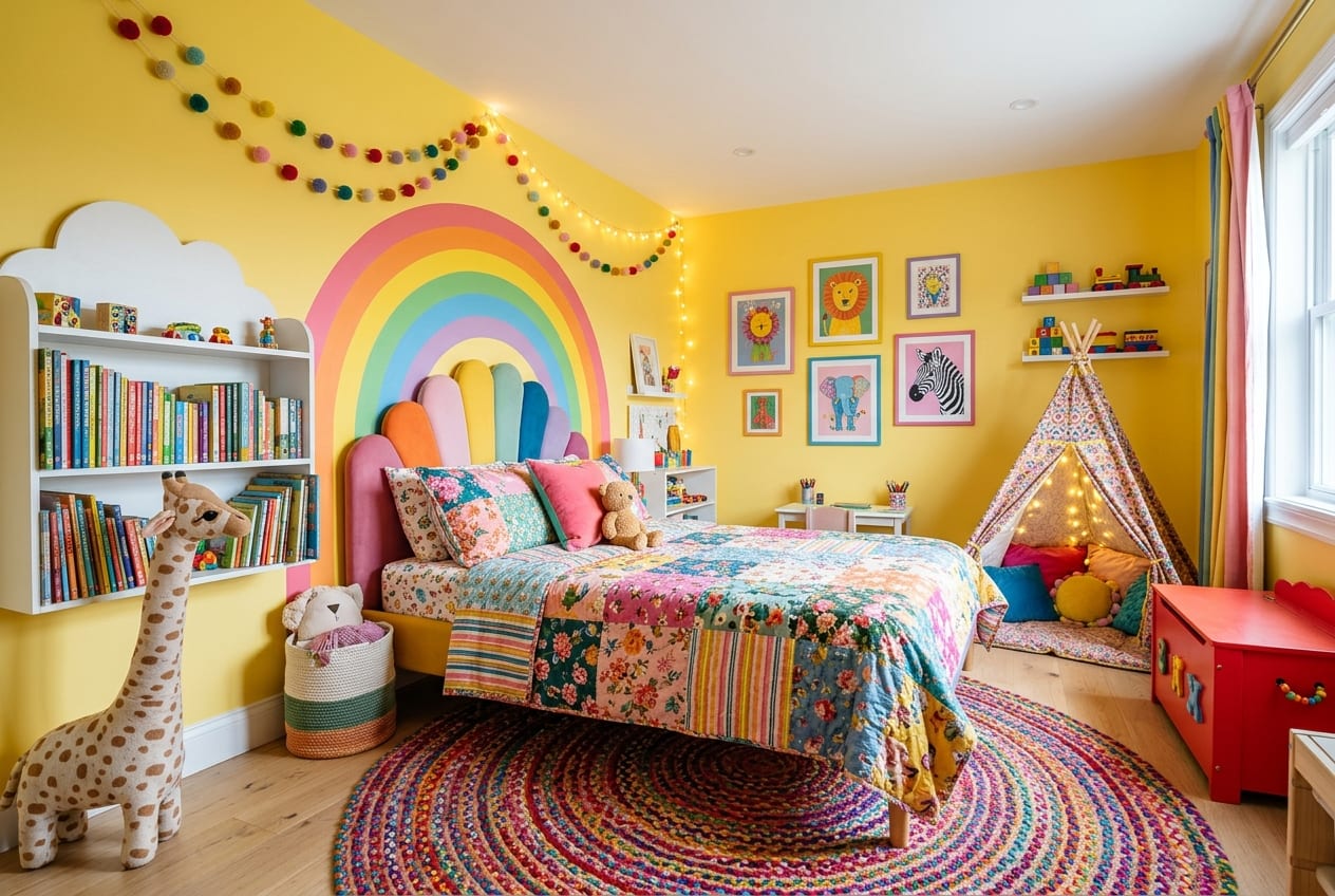
Sunny · The Rainbow Kids Room
Childhood in Technicolor Forever
Sunny proves that kids' rooms can lead the maximalist charge with sunshine-yellow walls, a hand-painted rainbow arc, and enough pom-poms and patchwork to make minimalists weep. The reading tent becomes a cozy cave of pattern, while primary brights layer across textiles, wall art, and toys in a way that feels curated rather than chaotic. This is dopamine decor that refuses to apologize for joy at any age.
Steal this: Paint one large graphic element like a rainbow directly on walls for instant primary-bright impact.
 5Save
Saffron · Art-Chaos Eclectic
Confidence Looks Like This
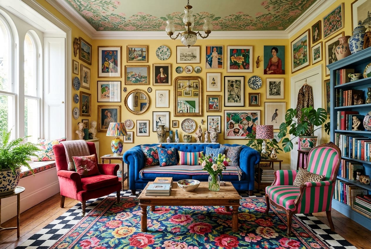
Saffron throws every color-clash rule into a blender and serves up art-chaos eclectic maximalism where primary brights collide with secondaries, tertiaries, and colors that don't have names yet. The gallery wall becomes a riot of frames and subjects united only by their refusal to coordinate politely, while pattern-mixing reaches Olympic levels across every surface. The philosophy here is simple: taste is just confidence with better lighting, and Saffron has both in spades.
Steal this: Build gallery walls around color chaos rather than coordination to let primary brights punch harder.
Primary brights in maximalist spaces are permission slips to stop playing it safe. These five rooms prove that red, blue, and yellow aren't just for children's toys and traffic lights—they're the building blocks of spaces that make you feel something the moment you walk in. Whether you Memphis-squiggle your way there or Mexican-cobalt-wall your path, the destination is the same: a room that chooses joy every single time.
FAQ
How do I use primary brights without making a room feel childish?
Layer primary colors with sophisticated patterns like terrazzo, geometric shapes, or traditional tile work, and ground them with one unexpected neutral or soft shade like lilac. The key is complexity—multiple patterns and textures make primaries feel intentional rather than accidental.
Can primary brights work in small spaces?
Absolutely—primary colors actually energize small rooms by creating focal points and visual interest that distract from square footage. Use one primary as your dominant wall color and let the other two accent through art, textiles, and accessories.
What's the best way to start adding primary brights to a neutral room?
Begin with one bold primary wall or a large painted graphic element, then echo that color family in smaller doses through pillows, art, and decorative objects. Build confidence gradually, adding more primary punches as you discover what makes your space sing.