The Style Guide · Dopamine Decor
Color-Drenched Rental: How to Get Nora's Bold Berry Look
Nora committed to one color and never looked back—bold with an exit plan, confident she'll still get her deposit back.
What is Renter-Friendly Color Drench?
Color-drenched maximalism is the art of wrapping an entire room—walls, trim, ceiling, the works—in one saturated, unapologetic color. It's not an accent wall. It's total immersion. Nora picked berry and went all in, creating a cocoon that feels both brave and surprisingly calming. The magic happens when you stop treating color like something to be rationed and start using it like paint is free and life is short.
This approach has roots in the Georgian era's jewel-box rooms and the 1970s' fearless embrace of single-color environments, but it's having a dopamine-decor renaissance right now. Designers like David Hicks proved that monochrome doesn't mean boring, and today's renters are discovering that bold color creates architectural interest where boring white walls once stood. It's maximalism's answer to minimalism: instead of more stuff, you get more color, which transforms ordinary rooms into destinations.
People love color drench now because it's an instant personality transplant for generic spaces. Rentals especially benefit—suddenly that beige box has a point of view. It photographs like a dream, makes small rooms feel intentional rather than cramped, and proves you don't need to own the walls to own the vibe. Plus, painting back to white takes one afternoon. The commitment is temporary. The confidence boost is not.
The signatures
- One saturated color on every surface, including trim and ceiling
- Berry-pink-plum family as the signature palette
- Velvet textures that catch light differently throughout the day
- Chartreuse or acid-bright pops that make the base color sing
- Removable solutions wherever possible
- Confidence that reads as coziness, not chaos
Anatomy of the look
Color & Paint
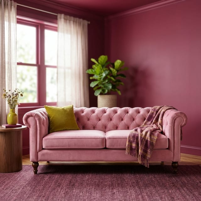
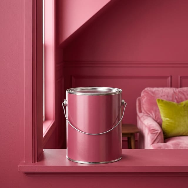
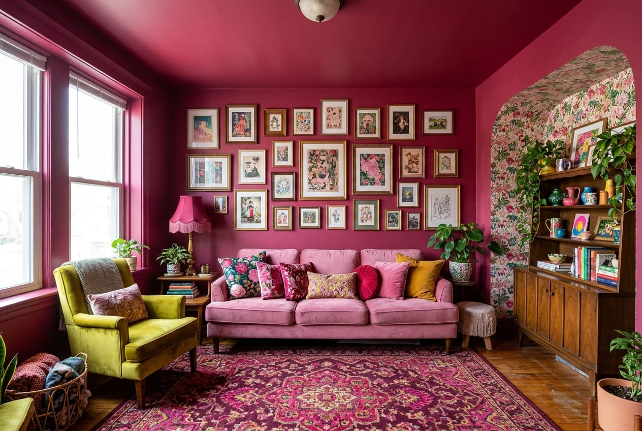
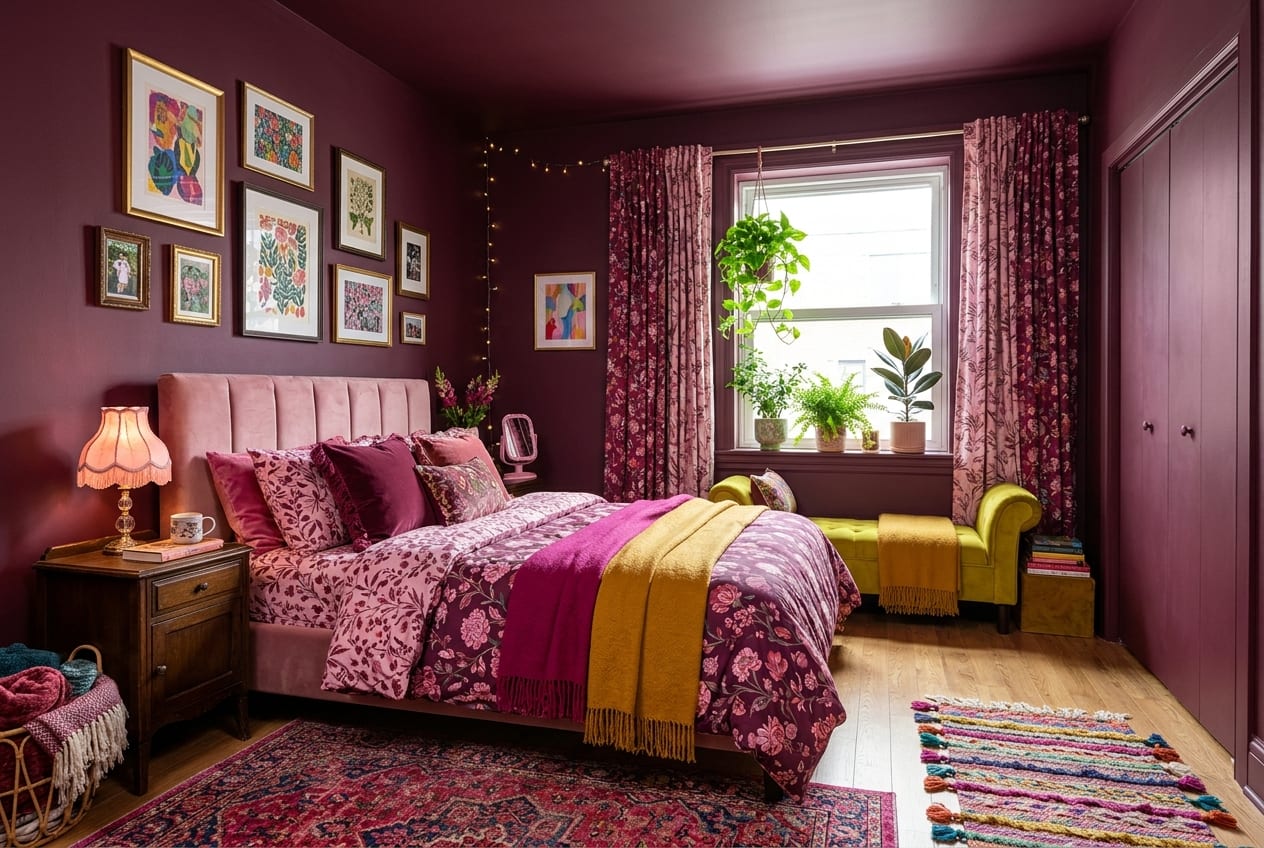
Nora's raspberry walls extend to the ceiling and trim, erasing architectural boundaries and creating that signature cocooning effect. The single-color approach makes the room feel larger and more intentional, not smaller—your eye travels smoothly instead of stopping at contrasting trim. In the bedroom, she goes even deeper with plum wine, proving that darker doesn't mean depressing when you commit fully.
Walls & Pattern
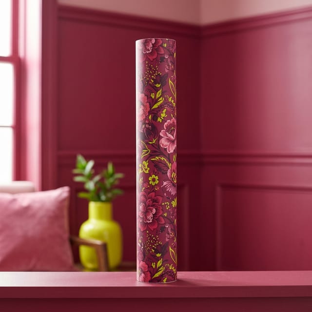
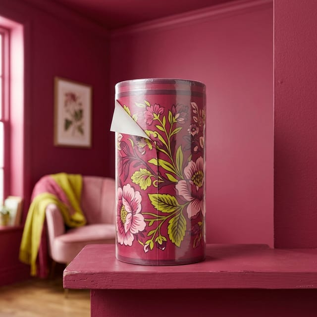
Where painting isn't possible, Nora uses peel-and-stick wallpaper in coordinating berry tones—some solid, some with subtle texture. A removable wallpaper border adds visual weight at the ceiling line without permanent commitment. The pattern stays tonal; this isn't about busy prints but about creating depth within a single color family through texture and sheen variation.
Furniture & Shapes
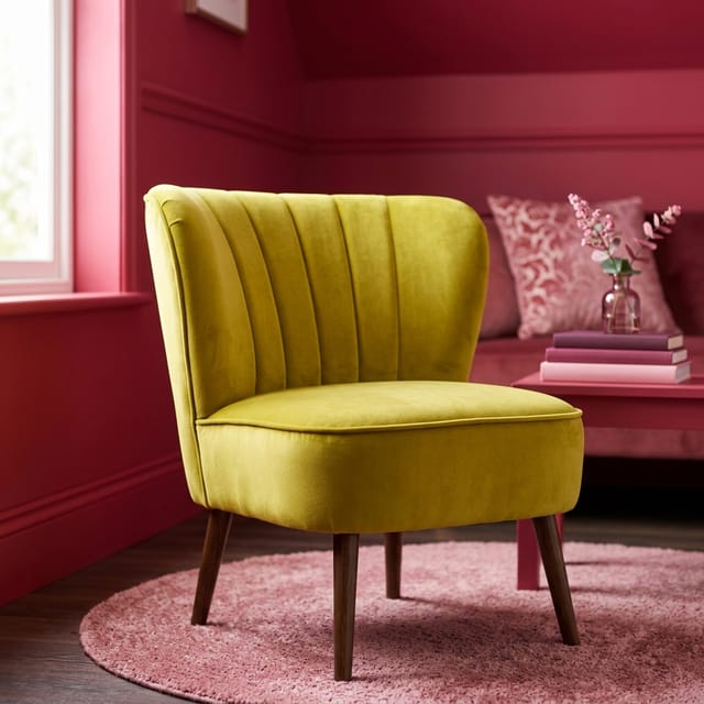
The pink velvet sofa is Nora's anchor—a shade lighter than the walls so it doesn't disappear but still lives in the same color family. Her chartreuse accent chair provides the only real color contrast, a citrusy jolt that makes the berry tones feel even richer. Furniture shapes stay simple because the color is doing all the talking; curves are welcome but fussy details would compete.
Textiles
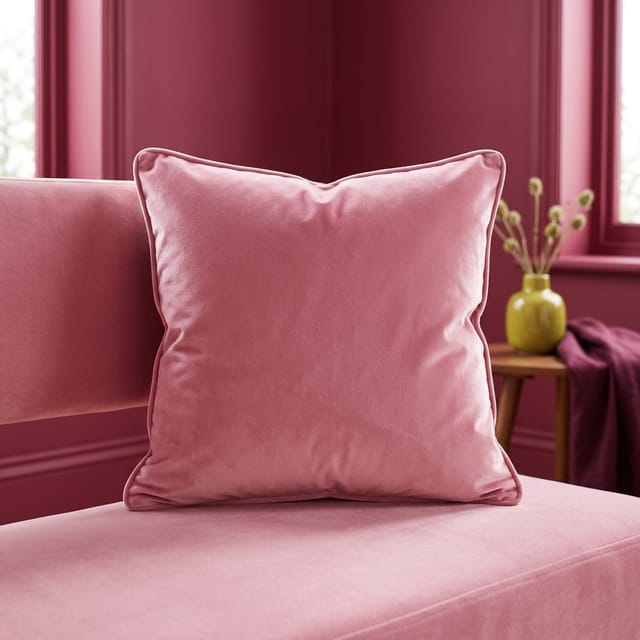
Velvet is Nora's texture of choice—it shifts from light to dark as you move through the room, adding dimension without adding color. Pink velvet cushions layer onto the sofa in slightly different shades, creating tonal interest. Throws and rugs stay in the berry-to-pink range, with maybe one chartreuse pillow to echo the accent chair. The goal is tactile variation within chromatic discipline.
Lighting
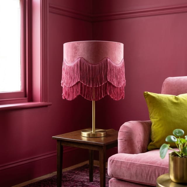
Lighting in a color-drenched room is critical—it's what keeps berry from feeling like a cave. Nora uses warm-toned bulbs (never cool white) and plenty of sources: table lamps, floor lamps, even string lights. A fringed lampshade in cream or pale pink softens the light and adds texture. Brass or gold fixtures warm up the cool undertones in raspberry.
Collections & Accessories
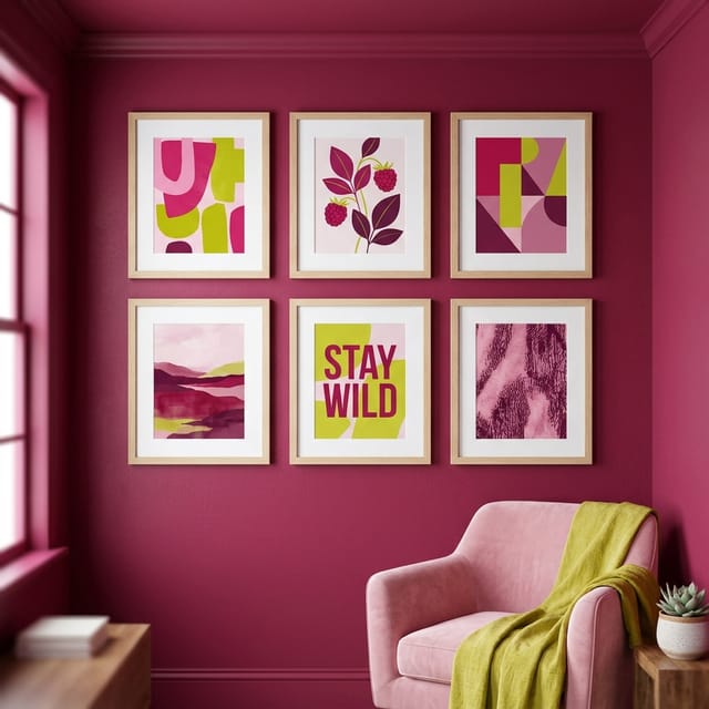
Nora's art and accessories stay tonal or provide tiny pops of that chartreuse. Framed print sets in pink, red, and cream tones reinforce the palette without introducing new colors. Mirrors in gold or natural wood frames bounce light around. Books get arranged by color—all the pink and red spines together. Even practical items like storage boxes come in coordinating shades.
Plants & Flowers
Plants provide the only true green in Nora's space, and that contrast makes both the plants and the walls more vibrant. She favors deep green, glossy-leaved varieties that hold their own against saturated color. Fresh flowers in pink, red, or even that chartreuse echo the palette. The pots? Berry-colored ceramic or natural terracotta that picks up the warm undertones.
The recipe
The Nora Formula
- 1One saturated color on 90% of surfaces—walls, trim, ceiling
- 210% contrast in a complementary bright (chartreuse to berry's raspberry)
- 3Velvet and texture to create dimension within the monochrome
- 4Warm lighting to prevent the color from feeling cold or flat
Paint picks
Raspberry #9C2B57
Main walls, trim, and ceiling in living spaces for full immersion
Pink Velvet #F1A7C1
Accent wall in bedrooms or as ceiling color if raspberry feels too intense
Chartreuse #C9D84B
Interior of bookshelves, back of cabinets, or one accent wall for contrast
Plum Wine #5C1A33
Bedroom or powder room for a moodier, more intimate version of the look
Room by room
Living Room
This is where Nora's look truly shines—drench the entire room in berry, then layer in pink velvet seating and one chartreuse chair for pop. Multiple light sources keep it from feeling heavy, and a large mirror reflects light back into the space.
Bedroom
Go even deeper here with plum wine on all surfaces for a cocooning, romantic effect. Keep bedding in the pink-to-berry range with cream accents, and make sure you have warm, dimmable lighting. The monochrome approach actually helps small bedrooms feel more restful.
Kitchen & Dining
If you can't paint cabinets, use peel-and-stick wallpaper on one wall and paint everything else berry. Swap in pink dish towels, a chartreuse fruit bowl, and berry-toned dishware displayed openly. Even rental kitchens can participate through accessories and removable backsplash.
Bathroom
Small bathrooms are perfect for color drench because the commitment is lower—less wall space means less paint to undo. Berry walls with pink towels and a chartreuse bath mat create a jewel-box moment. Replace the shower curtain and bath accessories in coordinating tones.
Small Spaces & Rentals
Tiny spaces benefit most from this treatment because the monochrome approach eliminates visual clutter and makes the room feel intentional rather than cramped. Use removable wallpaper if painting isn't allowed, and remember: you can always paint back to white when you leave.
Get it on any budget
Under $200
Under $500
Splurge
Renter-friendly
- Use peel-and-stick wallpaper instead of paint if your lease forbids it—the effect is identical and removal takes minutes
- Paint with landlord permission and keep detailed notes on the original color for easy restoration (or negotiate leaving it as an upgrade)
- Focus color drench on furniture, textiles, and accessories if walls are off-limits—a pink velvet sofa against white walls still makes a statement
- Removable wallpaper borders at the ceiling line create architectural interest without touching paint, and they're perfect for renters who want some commitment without the full drench
Easy to avoid
- Using cool-toned lighting in a warm-toned color drench—it'll make raspberry look muddy instead of rich, so always opt for warm white or soft white bulbs
- Introducing too many accent colors—one contrast pop is exciting, three is chaos, so stick with your berry base and one bright complement
- Forgetting about sheen variation—all flat paint can look dead, so use satin or semi-gloss on trim and consider a subtle texture wallpaper for dimension
- Skipping the test—paint large sample boards and live with them for a few days in different lights before committing to gallons, because berry can shift dramatically from morning to evening
FAQ
Will a color-drenched room make my space feel smaller?
Counterintuitively, no—painting everything one color actually makes rooms feel larger because it eliminates visual breaks that chop up the space. Your eye travels smoothly around the room instead of stopping at white trim or a contrasting ceiling. The key is good lighting and not cluttering the space with too much furniture.
How do I choose the right saturated color for color drenching?
Pick a color that genuinely makes you happy, not one you think you should like. Test it in large swatches in your actual space, watching how it looks in morning, afternoon, and evening light. Warm-toned colors like berry, terracotta, and olive tend to feel cozier than cool blues or grays, which can read stark when everywhere.
Can I do color drench in a rental without painting?
Absolutely—peel-and-stick wallpaper in solid colors creates the same immersive effect as paint and removes cleanly when you move. You can also achieve a version of the look through furniture, textiles, and accessories in a single color family, though it won't have quite the same architectural impact as colored walls.
What's the best way to add contrast without ruining the monochrome effect?
Choose one complementary accent color and use it sparingly—about 10% of the room. For Nora's berry, chartreuse provides that citrusy zing. Use it in one accent chair, a few pillows, or the interior of a bookshelf. Avoid introducing additional colors; the power comes from discipline.
How do I keep a dark color-drenched room from feeling like a cave?
Layer multiple light sources at different heights—table lamps, floor lamps, sconces, even string lights. Use warm-toned bulbs (2700K-3000K) and consider adding mirrors to bounce light around. The more light sources you have, the more dimensional and jewel-like your dark color becomes instead of feeling heavy.
Some links may earn MAX by Design a small commission at no cost to you.